Blog Refurbishment
Under new management

To my grand audience of absolutely nobody, I present: this blog, but better!
I’ve been putting this off for a while. I don’t like to think of myself as a web designer, and I didn’t have compelling reasons to work on setting up anything more complex than the default recommended Jekyll+Pages setup.
This changes today. I’ll be out of the military soon, and that means I need a :glowing_star: stunning :glowing_star: website for employers to see. Plus, I’ve gotten the writer’s bug as of recent, and I want a place to throw my words on that doesn’t look as bad as v1 of this site.
Finding Hugo
Like many other Rust developers, I read Faster Than Lime. Their blog looks really nice, and I wanted to copy it, so I looked for their blog post on how they developed their site.
Answer: really complex stuff! But then I read this part:
I definitely remember using nanoc (Ruby), and switching to jekyll (Ruby) at some point. When I launched the Patreon integration, I was using hugo.
Now, I really don’t want to be spending any time saying negative things about projects in this post - not when there’s so much cool stuff to show off! So all I’ll say is this: hugo was easy to get started with, and it stayed relatively out of my way.
I forked one of the more minimal themes, and added the pieces I wanted: cool bear’s hot tip, some navigation, etc.
Well, that’s not exactly an endorsement, but I’ll take it over the less trodden path.
Let’s google, “Hugo themes”:
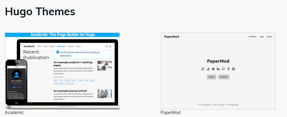
That one on the right looks pretty good! Let’s try it.
Papermod
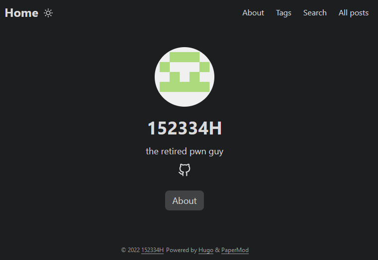
Fast and pretty good! Setup worked entirely as expected, except…
- I wanted to mix the centered “profile mode” (pictured above) with a post list, but that wasn’t a default option
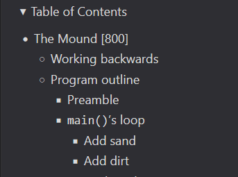
- Their TOCs uses the default Hugo style. It doesn’t look pretty enough:

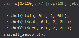
- Syntax highlighting was somewhat wrong. See the unhighlighted second
Ls here:
So I decided to look for another theme. I eventually settled with LoveIt.
Installing LoveIt
I faced many, many technical problems trying to get this theme to run. In order:
After installing the theme as a submodule, I got an error running
hugo server -D:Module "LoveIt" is not compatible with this Hugo version;This was confusing because I had the latest Hugo version (v0.101), and the stated required version for the LoveIt theme was v0.64
A round of googling later, and I figure out the error message actually happens because my
hugoinstallation wasn’t compiled with the SCSS extension. I try to download an-extendedrelease, but I find out that thehugomain repository does not publish-extendedreleases forarm64CPUs, which I need because I’m using a Raspberry Pi for this.I attempt to compile the extended version of hugo directly on my RPi. This fails, because
go installrequires more than 0.5 GB of memory, which my little tiny machine cannot offer.I attempt to cross-compile Hugo from a better machine. This fails with an abstruse error message.
I eventually figure out that it failed because compilation requires
go>=1.18. After updating, the cross-compilation fails again, because Hugo depends on a C/C++ library that is more difficult to cross compile (this is the same reason that the main repository does not give-extendedreleases)I luckily find a repository (https://github.com/hugoguru/dist-hugo/releases) that has compiled
-extendedversions of Hugo for ARM. This ends the torment, mostly.
After that mess, it runs:
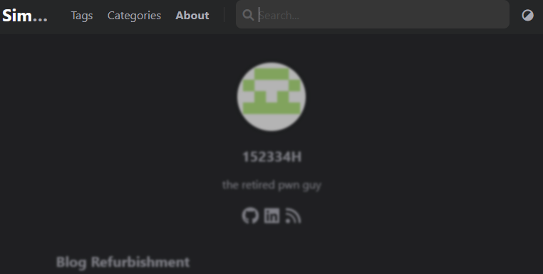 Hurray. Let’s move on.
Changes
So, what’s new about the site? Is it just a CSS refresh?
Not exactly. Although I was mostly motivated by the idea of getting the site to look :sparkles: prettier :sparkles:, the new framework comes with several added features:
- Searching. The screenshot above shows this.
- Emojis, like the ones above.
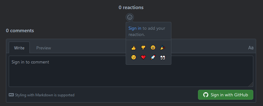
- Post reactions! With the power of giscus:

- Shortcode. I make good use of them in my about page.
- Better development experience. You won’t see this on the site, but the file/post structure for Hugo is much more pleasant than Jekyll was.
I also made a few small changes to the LoveIt theme for this site, mostly to embed images more easily. See here
Moving forward
I didn’t do all of this designer work just to let it rot like the last one. Moving forward, I’ll be pushing posts to this site weekly, whether anyone reads them or not. It’ll be somewhat like Matt Rickard’s blog: a regular stream of short posts on tech things. I have enough of a backlog to keep this up for several months, and I plan on going on ad infinitum.
